

We’re excited to introduce Pauline Petit, a renowned French artist born in 1986 in Normandy. Best known for blending photography, illustration, and painting, she has made significant strides in the art world since becoming a professional portrait photographer in 2007.
Her blog, “apprendre-la-photo-de-portrait.fr,” has attracted over 25,000 followers, a testament to her influence and expertise. Pauline’s unique style, evident in her acclaimed series “The Graphic Portrait” and “Figures of Style,” combines humor, graphic design, and aesthetic appeal. Her approach to photography as a form of popular art has garnered her international recognition, including awards and exhibitions. Beyond her artistic talents, Pauline’s role extends to being an art director, stylist, and retoucher, showcasing her versatility and dedication to her craft. Join us as we explore the fascinating world of Pauline Petit, where each photograph tells a story and captures more than just an image.[Official Website]
One of the most visually striking bodies of work within this issue, what initially calls to my attention is the consistency and precision of each individual portrait. When analysing each portrait closer, the combination of graphic design, straight lines or proportionally placed curves is very evident. Is there a specific meaning behind some of these portraits or is this collection solely based on a body of work which focuses on aesthetics, symmetry, and uniformity?
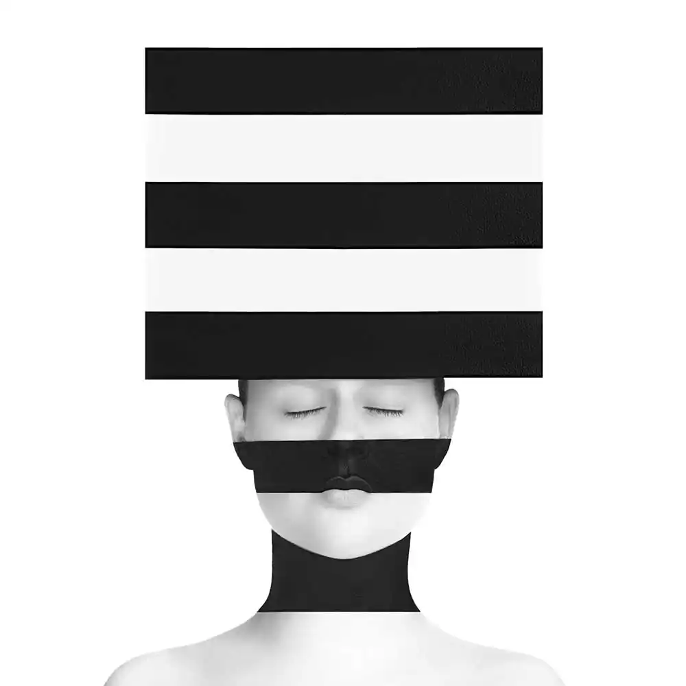
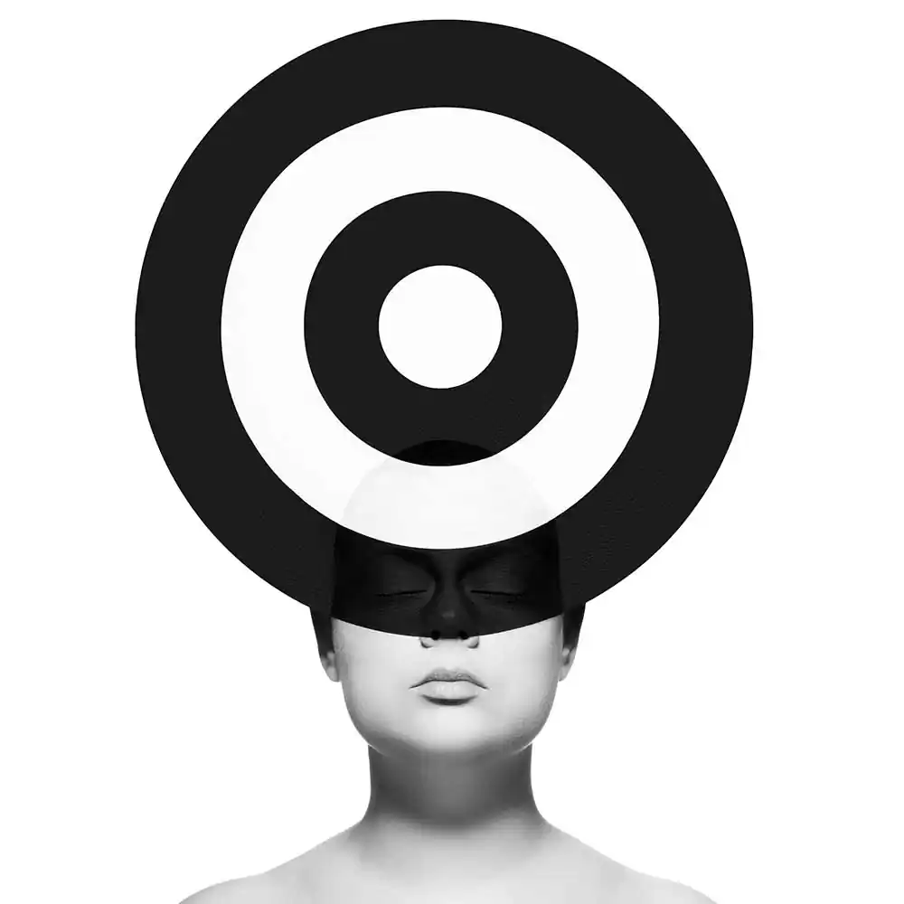
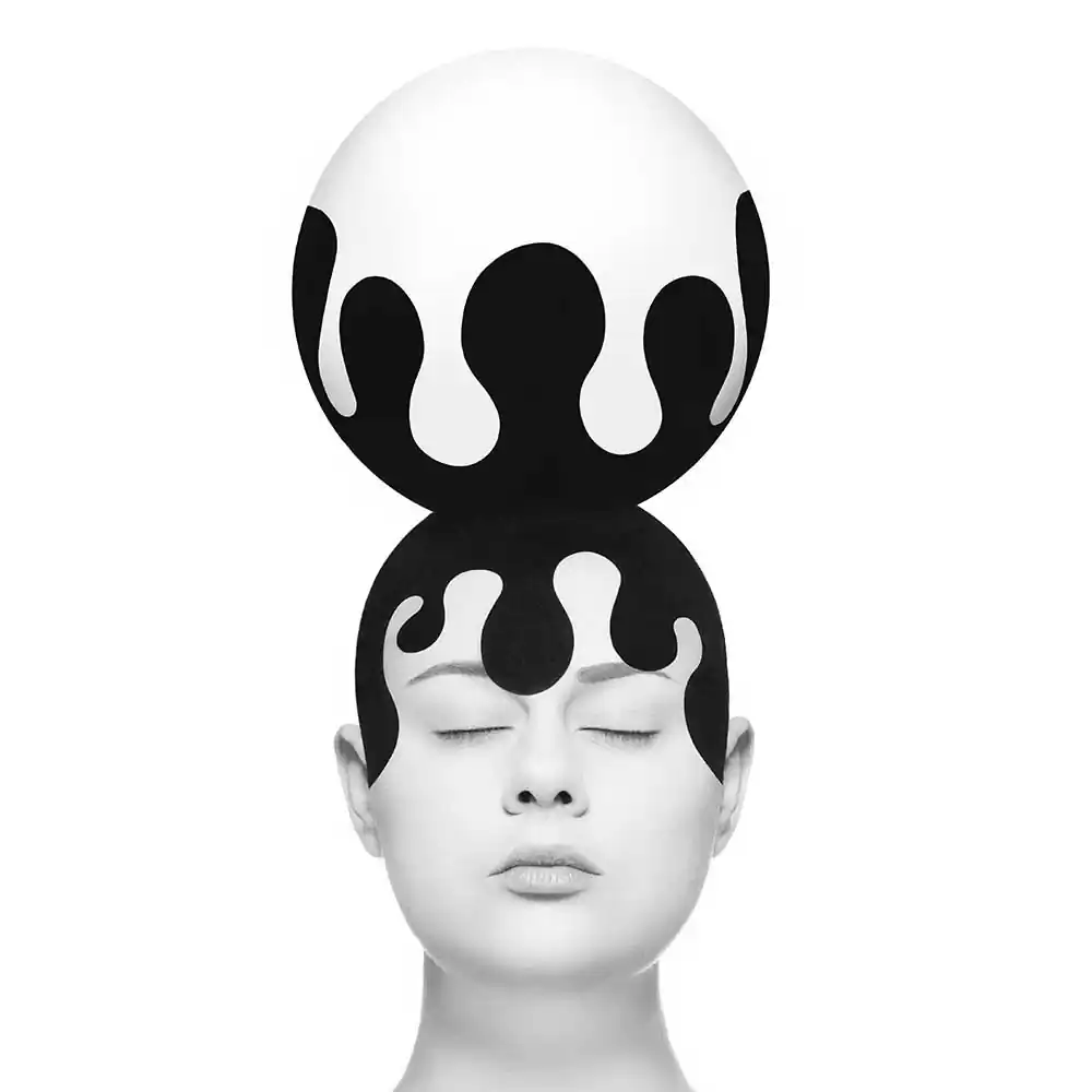
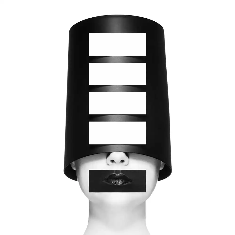
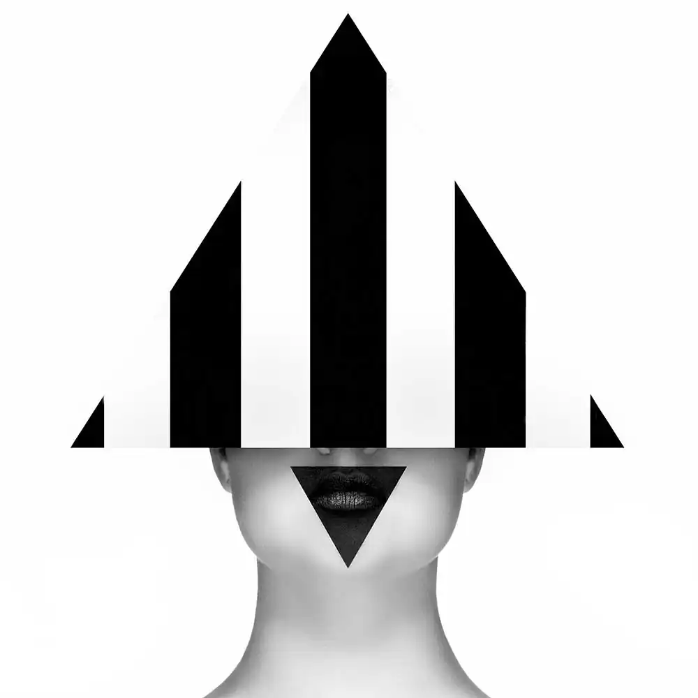
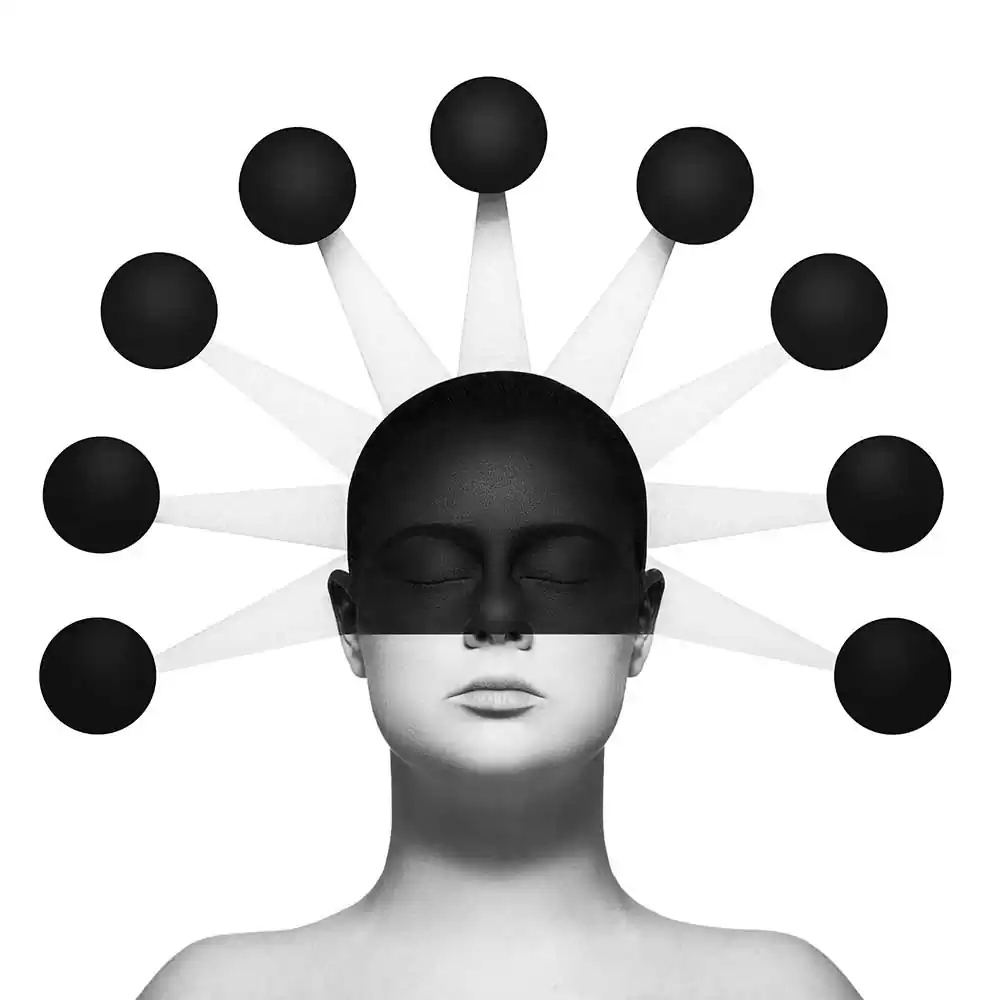
The “Hat Heads” series offers two approaches.
The first approach involves an aesthetic search for composition, shapes, lines and contrasts, with the aim of creating strong, minimalist, modern portraits.
The second approach, on the other hand, provokes in-depth reflection on fashion photography.
By capturing portraits with salvaged objects (trash cans, curtain rings, cheese dishes, etc.), this series takes a stance opposed to the underlying luxury often associated with traditional fashion photography.
Using recyclable materials, she questions established norms and reinvents style.
I am a little curious about your editing process and planning for one of these shoots. As I analysed most of these photographs, I noticed that there was quite a bit of texture within the various graphical elements and shapes. You do mention that the hats within this series are made of recycled material, however, I am interested to know how you use photoshop to create a balance between the textures and shapes that you use from the recycled materials?
My creative process consists of 5 stages :
For each of my ideas, I make a sketch (I have a small notebook that I always carry with me).
With this sketch, I check the feasibility of the project and balance the different accessories or shapes, as well as the light and dark areas of my image.
Then I create my accessories.
On the day of the shoot, I do all the make-up myself. I do a lot of self-portraits, so I use a tripod and my camera’s intervalometer.
Finally, I post-process my photos on Photoshop. To enhance my textures, I use the techniques of fashion retouchers : Split Frequency and Dodge and Burn. I don’t do any photo editing. I don’t use AI. All the elements in my photos exist when I take them.
Before even looking at the title of this series, I initially thought of hats or crowns. My mind initially went to traditional head pieces from tribal cultures and how your work might draw inspiration from this. The elaborate crowns or hats which might signify importance or status of some kind have been stripped down and devoid of any colour, giving birth to your photographs. Would you say that you have drawn inspiration from this and if so, is there any specific hat or crown that has been the centre focus of this project?
The sources of inspiration for this series do not come from tribal cultures.
Rather, my creative approach is to simply shape and combine geometric shapes, creating patterns that I then transpose with make-up onto my face.
This approach aims to create visual continuity.
Comedy is not something that initially strikes me when I look at your work, I feel that in some cases I am seeing elements of Yayoi Kusama’s artistic interpretations. It seems that your work deals less with comedy and more about the joyfulness of simple shapes and line work. The image on p19 of the mushroom head is one example of this joyfulness of which I am referring to. To me it’s a clear blend of fashion, art, and photography. I am curious to know, which one of these you associate with most and how do you find balance in your work?
I think I define myself primarily as a multidisciplinary artist who uses the photographic medium to create.
I don’t feel close to fashion. Maybe more like illustration.
Speaking of comedy, another series of yours titled ‘Le Portrait Graphique’ directly showcases comedy by re-creating various characters from film, TV and pop culture. One of my favourite images from this series has to be the photograph, recreation depicting Lisa Simpson from the Simpsons TV show. I love he facial expression and the separation of what elements are in black and what elements are in white. Could you tell us a little more about why you made this series and what your focus was here?
The Graphic Portrait is my very first series.
When I started it, I didn’t even know I was making a series. I simply made portraits on themes I liked.
My inspirations do indeed come from pop culture, but also from surrealism, caricature and optical illusion.
When I became aware of the coherence of these portraits, I continued in this direction with the aim of proposing a form of art photography accessible to everyone, children and adults alike, since everyone can find personal references in them.
Another aim is to offer light, humorous visuals, in contrast to the anxiety-inducing images disseminated by the media.
My final question is somewhat different to my previous ones. It has to do with printing as on your website you state that you print on Hahnemühle photo paper. A paper that is of very high quality and produces some great archival prints. How have you come to print on this paper as opposed to others as I am quite interested in your printing process of an image. As there are huge amounts of black and white elements to consider how have you managed to work around this for fine art printing?
In my entire creative process, I strive for perfection.
So when I wanted to offer my photos as works of art, I also sought excellence. To ensure the highest quality prints, I undertook extensive research and testing with several papers and laboratories.
Among the choices available, Hahnemühle photo paper emerged as one of the best in the world.
I specifically opted for the PhotoRag finish because of its exceptional matte finish, perfectly suited to my artistic style. Its fine, smooth texture provides an ideal support for my own meticulous texture work.
The Bright White option was chosen to offer a true white, even a cool white, which perfectly matches the strong contrasts present in my shots. Finally, to ensure the faithful reproduction of my photos, I work meticulously on a calibrated screen, guaranteeing optimum precision in the creative process.