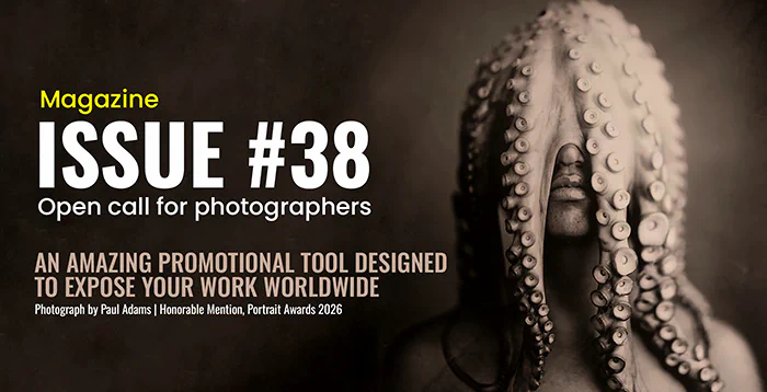


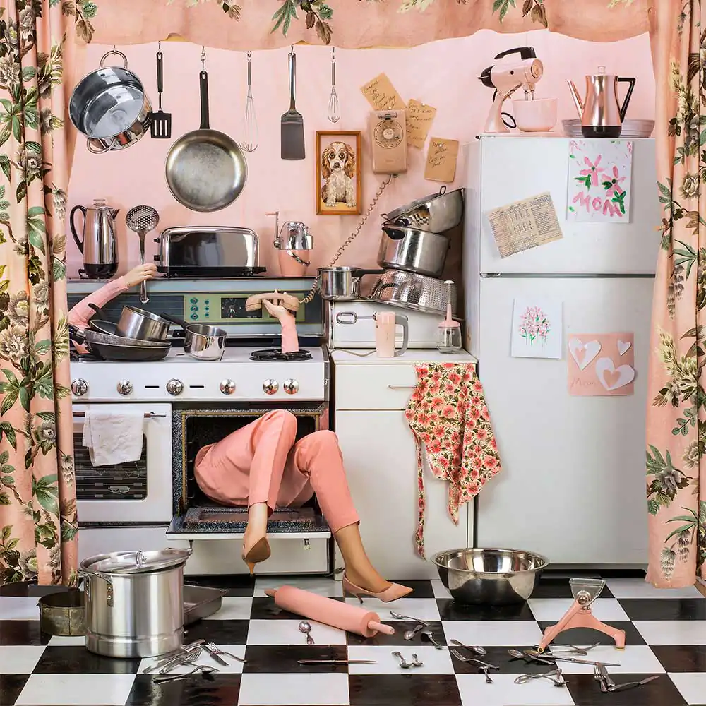
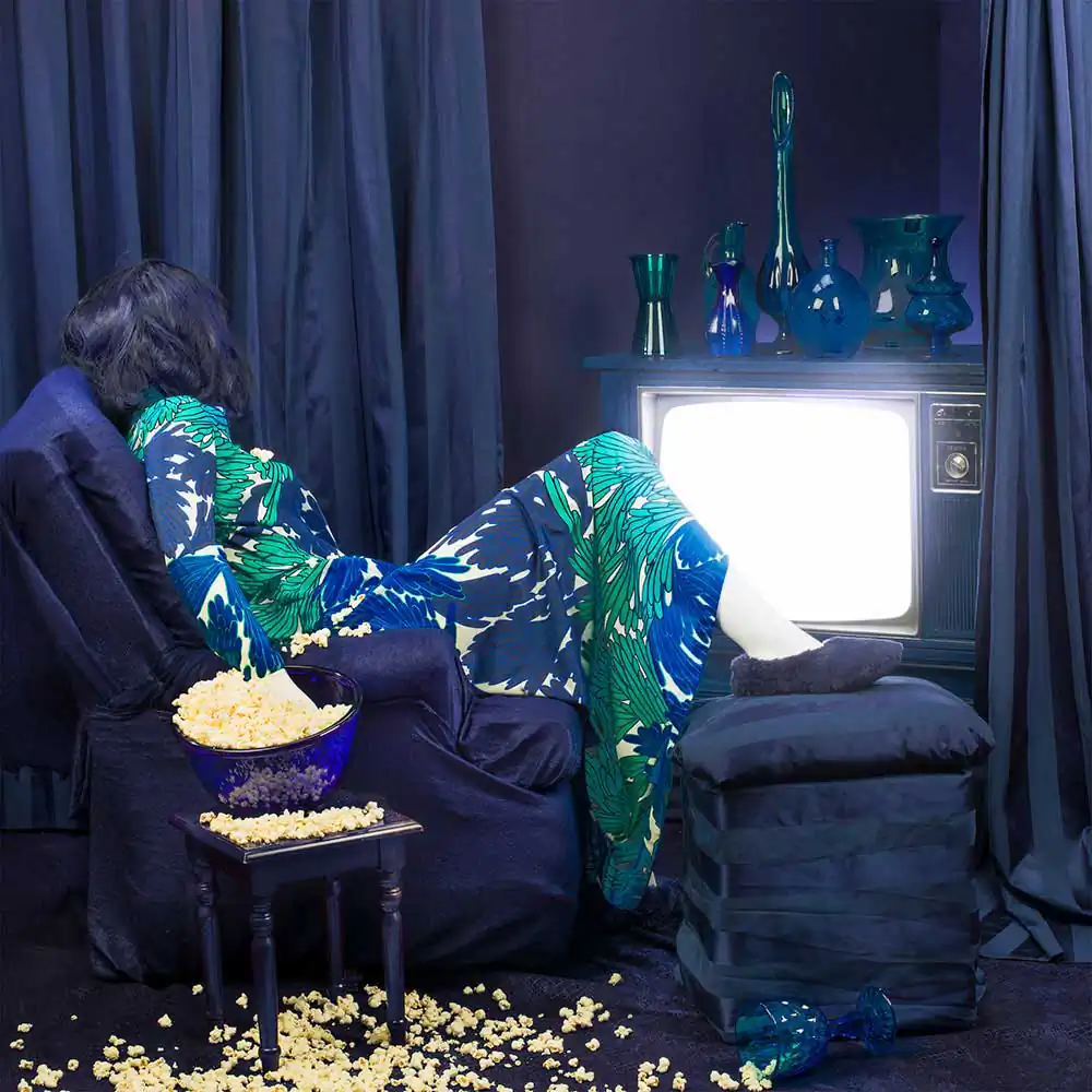
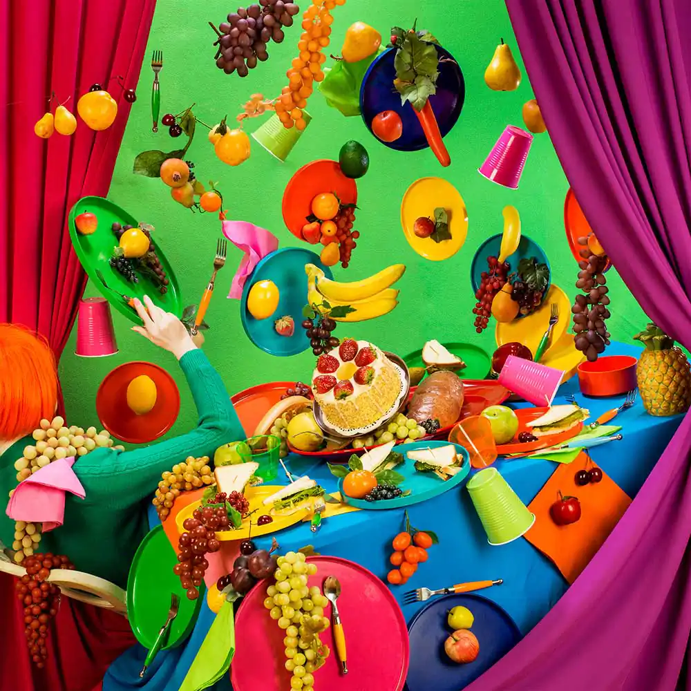
Patty Carroll has been known for her use of highly intense, saturated color photographs since the 1970’s. Her most recent project, “Anonymous Women,” consists of a 3-part series of studio installations made for the camera, addressing women and their complicated relationships with domesticity.
By camouflaging the figure in drapery and/or domestic objects, Carroll creates a dark and humorous game of hide-and-seek between her viewers and the Anonymous Woman. The photographs were published as a monograph, Anonymous Women, in 2017 by Daylight Books, and the current series is a new monograph, published in 2020 by Aint-Bad as Anonymous Women: Domestic Demise.
The Anonymous Woman series has been exhibited internationally and has won multiple awards including Carroll being acknowledged as one of Photolucida’s “Top 50” in 2104 and 2017. Her work has been featured in prestigious blogs and international magazines such as the Huffington Post, The Cut, Professional Photographer, and BJP in Britain. Her work has been shown internationally in many one-person exhibits in China and Europe, as well as the USA. (White Box Museum, Beijing, Art Institute of Chicago, Royal Photographic Society, Bath, England, among others.) She has participated in over 100 group exhibitions nationally and internationally, and her work is included in many public and private collections. After teaching photography for many years, Carroll has enthusiastically returned to the studio in order to delight viewers with her playful critique of home and excess. She is currently Artist in Residence at Studios Inc. in Kansas City, Missouri. [Official Website][Print Edition][Digital Edition]
I’d like to begin this interview by discussing your latest body of work, ‘Anonymous women’. The first thing which caught my eye were the colours and pop art way of presenting your subjects. Are you inspired by pop art or strands of surrealism which some of your images seem to encompass?
My favorite artwork is/has been pop art, the Chicago imagists and surrealism. DeChirico is my latest favorite of the surrealists, and Ed Paschke has always been a favorite painter. Although I am a photographer, this series is really influenced by painting, because I am trying to put together elements that push reality out of skew, which is anti-realistic. Unfortunately, photography is based in reality, so we have to create something absurd to photograph.
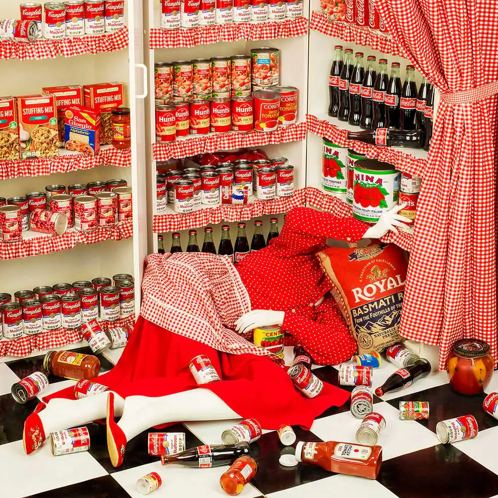
Continuing on from my previous question about inspirations, the attention to colour and composition really reminds me of the artist YaYoi Kusama, and her work with spotted pumpkins. Kusama’s application and repetition of colour is reminiscent with images like ‘Home Sweet Home’ and ‘Picnic Bees’. Whereas other photographs such as ‘Canned’ seem like a direct reference to Andy Worhol’s soup can prints. Are both these artists important to you when planning and considering the structure of a set?
Yes, for the “Canned” picture, I wanted to do a commentary on abundance using a pantry or cupboard. So when I started to consider food, it was immediately obvious that it had to be Campbell’s soup, which determined the red and white theme to the picture. As for Kusama, I have loved her work for years. It is not necessarily a direct relationship, but I am attracted to anything that is colorful and uses a lot of pattern to confuse the space in the image.
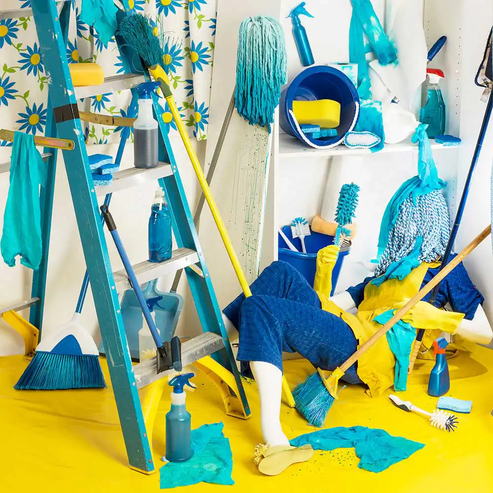
Could you tell us a little bit about the importance of colour as an artist and photographer? What drives you to use such a saturated pallet, especially when we look at images like ‘Flying Food’ which showcases this relationship between colour and ‘domestic disasters’ in a very surrealistic and dream like way?
The entire series of these pictures is also influenced by my love of old movies, especially musicals in the 1950’s and 1960’s. They are particularly saturated in color, and often use dream sequences. Think of An American in Paris, or West Side Story. They have a non-realistic color palette not seen today.
I have always loved bright, saturated primary colors, maybe the way a kid does. Color is emotion, life, and energy. I try to “get away” with as much crazy color as possible. In this series, more is more.
Moving on from technique and application, the actual meaning behind this body of work is grounded in response to the traditional notions of women and their role in society. I feel like you have not only achieved success in showcasing this idea of the ‘demise’ and the overwhelmingness of monotony, but a somewhat playful
façade has been layered over each image. Was it your intention from the start to create a body of work that juxtaposes the seriousness of the task or chore with the comical side of tragedy?
I grew up in a house where you had to have a sense of humor, or you would crumble. My mother taught me to laugh at myself, other tragedies, and keep on going. It has finally found its way into my pictures. I see life as a an endless supply of bizarre and wonderful jokes that are based in relentless sorrow. Yes, it is my intention to highlight the humor in serious issues. If someone will enjoy the beauty and/or color in an image, they will perhaps stay to consider the content.

Is this body of work as much an investigation of the monotony of housework, undertaken by these housewives as well as a reflection of their mental state? I feel that many of these images tackle emotions and restrictions in very symbolic ways. ‘Nightmares’ is an example of this duality between the serenity of sleep and the irony of this activity as chore…
My photographs in this series are metaphors for the interior lives of women; how we substitute everyday objects and artifice and turn them into obsessions. As for the Nightmare picture, I was thinking about the monster under the bed that we knew was there as children. Even grownups have worries, anxieties, and dirty little secrets. The bed is a refuge, but also a place to hide from the nasties in the world we create.
You mentioned in your statement for this project that you drew inspiration from the game ‘Clue where murder occurs in one of five rooms’. Would you go as far as suggesting that this collection of images is an extension of such a game, and consequently, the viewers become the players, searching for clues within your images?
Hopefully, yes. I try to hide things in the photographs, but often they are too obvious. However, each of these pictures requires a lot of work that is not obvious. For instance, in “Booky” we covered every book in wallpaper samples so that the titles and text were not seen. If there is a lot of words in a picture, then people tend to read the words rather that look at the entire scene.
The game, “Clue” (called Cluedo in Britain) is a game everyone seems to know: a big house where a murder is committed but in what room by whom and with what weapon? My woman is always the one who is murdered or overwhelmed, but what is it that has caused it? Usually her own self!
Finishing this interview, I would like to ask if this project will continue further and possibly explore the theme of ‘Demise’ in a different way? If not what other bodies of work are you currently focusing on?
Right now, we are continuing the saga of the Anonymous Woman. If she ever does completely succumb to her worst self, she may emerge as a queen. On the other hand, I am making still life photographs in my studio in Kansas City, using household “collectible” objects found in antique malls and thrift stores. They have been focused on ceramic birds with floral backgrounds and accouterments camouflaging the birds. It is a riff on my women, who are hidden in their homes. The bird series has also morphed into an installation of many small pieces using the actual bird figurines and faux flowers. I am planning on photographing other kinds of household objects in still life pictures as soon as I can get back in the studio. Who knows, every day is an adventure in the studio!
Francesco Scalici
A recent MA graduate from the University of Lincoln, Francesco has now focused on landscape photography as the basis of his photographic platform. An author for DODHO magazine, Francesco’s interest in documentary photography has turned to writing and has had various articles, interviews and book reviews published on platforms such as: ‘All About Photo.com’, ‘Float Magazine’ and ‘Life Framer Magazine’. Currently on a photographic internship, Francesco has most recently been involved in the making of a short film titled: ‘No One Else’, directed by Pedro Sanchez Román and produced my Martin Nuza.