

Vicky Martin (UK) is an international award winning fine art professional photographer. Her first introduction to photography was whilst studying art and design at college in the 90s, she fell completely in love and found it to be a natural fit creatively, realising that this was what she wanted to do with her life she went on to dedicate her studying to photography.
She initially started out photographing in black and white but later moved on to color finding it to be a totally different way of photographing, and now tries to utilise the color in her photographs to benefit the overall narrative. Since 2008 after Vicky was awarded a prestigious bursary she has been developing her professional career in photography . Notably she has had her work published and exhibited nationally and internationally, from Europe to the USA in solo and group shows and her work continues to garner many awards and nominations most recently to include Portrait Photographer of The Year 2020 at the Minimalist Photography Awards, Finalist at the Lensculture Art Photography Awards 2019, Winner of the Professional Beauty and Fashion Category at the Chromatic Awards 2018, Winner of the All About Photo Magazine Colors issue 2018, Winner of the Single Image in the Professional Fine Art Category at the 12th Julia Margaret Cameron Awards 2018 and Winner of the Professional Fine Art Series at 2016 Fine Art Photography Awards. [Oficial Website][Print Edition][Digital edition]
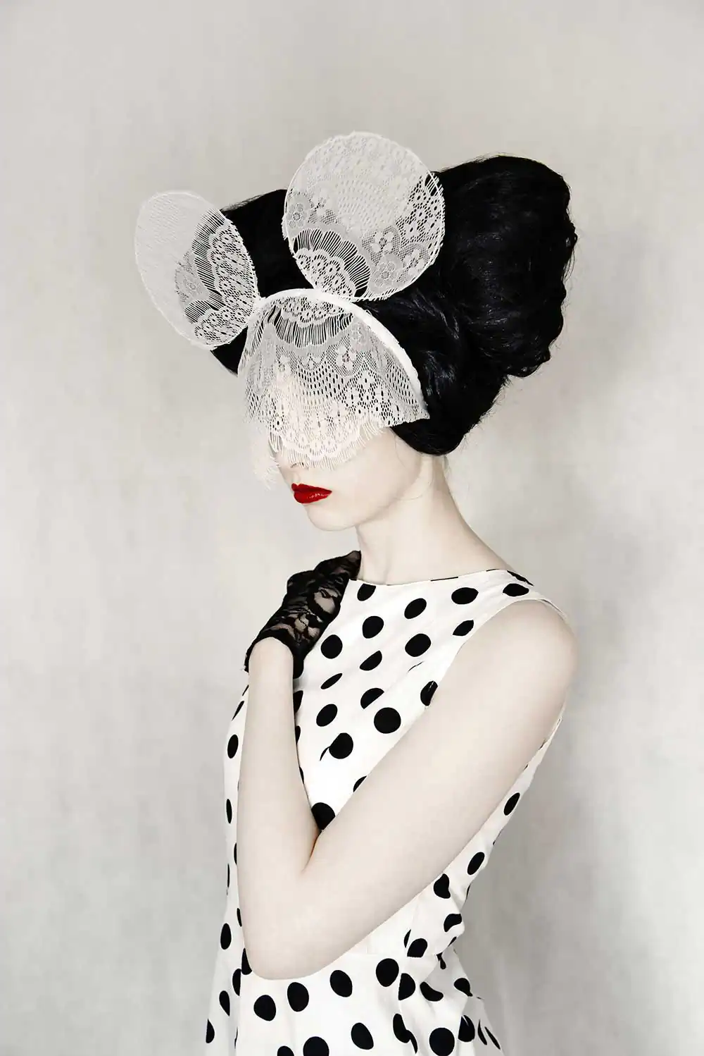
Straight of the bat I would like to discuss the cover photo itself and how much it re- minded me of the works of YaYoi Kusama and her Polka dot pumpkins and large rooms, filled (wall to wall with polka dots). As a fine art photographer, do you take inspiration from artists like Kusama and various other pop artists in order to realize your own photographs?
Firstly, thank you for the compliment that you were reminded of such an iconic artist’s work! However, I do not look to other artists for inspiration. The inspiration for my created protagonists comes from literature, film or everyday life. The initial inspiration for the cover photograph came from the Disney character Minnie Mouse however, the stereotype that is often placed on the female as being timid, much like a mouse, also filtered into my conception of the idea. The motif of the polka dots I used in this photograph I can see as being visually similar to that used by Kusama but, my intention was to create a contrast between the black and the white that reinforces the juxtaposition between vul- nerability and strength.
The cover photograph for DODHO magazine is of course part of a much larger col- lection of images depicting several women with their eye’s covered. You stated that: ‘the viewer is inspired to make their own inferences about the subject’s persona’. I’d like to know if this model is playing a character that you created, and we as the audience are attempting to understand that character’s personality?
Within the series Selfhood, I want to challenge the viewer to emotionally connect with each portrait image without being able to see the eyes. Traditionally the viewer attempts to discover the emotion and feeling of an image by looking into the character/model’s eyes and, removing this conveyer of mood encourages the viewer to use their own experiences to inform their interpretation of the photograph. Without the ability to make eye contact with the character of each image, the viewer if forced, in a sense, to make eye contact with themselves – they are forced to look within themselves for the emotion they identify in the image. Thus, ultimately the character’s personality is informed by the viewer’s own personality and own perception of the context and themes that inform the image.
What I absolutely love about this collection is actually the very first image of the lady with the red hat. I think that even though it may appear to be a simple photograph, everything looks to have been coordinated and precisely considered. Could you tell us a bit about your thought process behind this image? Possibly what inspired you to create this shot?
I’m fascinated by colour and how this influences our response to an image, either as art or in life itself. The inspiration for this photograph came from the idea of how the colours of red and white are associated with traditional female stereo- types. White signifies purity, innocence and virginity, while red symbolises promiscuity, temptation, sin, and often also fertility. The white dress depicts the idea of the female body being perceived as needing to be ‘spotless’, yet the red gloves and the striped hat demonstrate the paradox of a woman being expected to conform to two juxtaposing ideals. The inability to see the woman’s face behind the hat evokes the idea of the female being invisible in society, lacking recognition as an individual, as they are valued only in terms of their sexuality and reproductive capacities. The idea of combining this symbolism with the title “Sunday Best”- which embodies the idea of wearing your best outfit to church on a Sunday – is a construct intended to invite reflection on the question of does what we wear define who we are, who are we trying to be, how are we perceived?
Moving on from ‘Selfhood’, your project titled ‘Not in Kansas’ breathes colour and has some very interesting contrasting colours. It’s almost as if each image doesn’t belong because of how saturated the colour is but when put together they really tell a story. Could you tell us what attracted you to the film The Wizard of Oz and its protagonist?
I fell in love with the story and film The Wizard of Oz from a very young age. The transition from sepia tones to the Technicolour paradise of Oz was the moment I found most memorable and poignant, which definitely influences the aesthetic and colour saturation I create in ‘Not in Kansas’. I also felt empowered by Dorothy as she was one of the first strong female characters I was introduced to who didn’t conform to the archetype of the damsel in distress waiting for a knight in shining arm to save her: she used her brain, courage and heart to save both herself and her friends. Throughout my series, I reference the film and story either through the use of colour, the iconic symbols immortalised by the film or the title of an image, however the struggle between fantasy and reality, paired with the need to find a sense of belong- ing, is what infuses each image and connects the series as a whole.
It seems as if you are quite fascinated with stories like ‘Alice in Wonderland’, ‘The Wizard of Oz’ as well as books like ‘Great Expectations’. Would you go as far as to say that your photographs serve as a bridge between the love that you share with these stories, (and their fantasy elements of course) and how well they can serve as tropes in highlighting current or personal issues?
I feel definitely that there are parallels between the themes which I like to explore with my work and those that are depicted in the aforementioned stories. I think that the female characters in particular inspired me (whether they are tenacious like Dorothy, curious like Alice or, haunted by the injustices of a patriarchal society like Miss Havisham) as they embody values and emotions that are, to a certain extent, universal to the female experience. I also like to reference such iconic figures in order to add further layers of meaning to my work: the dialogues and discourses that surround these stories inform the viewer’s perception of the colours, symbols, location etc. that I use and, provide an opportunity for multiple interpretations. Using such recognisable texts and films allows my work to be accessible for the viewer, as it provides a familiar vehicle through which to explore and raise questions about both contemporary issues (particularly those concerning gender) and personal issues (such as how a sense of identity is constructed and found) that I engage with in my work.
As a final question, let’s briefly talk about your relationship with nature. Of course, many of these photographs require weeks if not months of planning. Getting the location, actors/actresses, make-up and so on. However, do you feel that sometimes photographing outside is just as important. Achieving the correct location must be pivotal in establishing the relationships between the characters you are portraying and their narrative?
Constructed narratives involve a great deal of preparation and planning, which means that I particularly like to work in the controlled environment of the studio as time constraints become less of a pressure. However, as your question rightly suggests, the choice of location can be a pivotal part of the narrative of the series and, sometimes on outdoor setting is required to enhance the symbolism and meaning of an image. For example, my most recent completed series ‘Curiouser and Curiouser’ was photographed in Las Vegas, a modern-day Wonderland, that provides the backdrop for the protagonist to discover, struggle with, and eventually come to terms with her own feelings of not fitting in, the scale of which just would not have been achievable in a studio setting. Working on location also provokes a lot of improvisation and spontaneity, which can at times be pressurised due to time limits and weather issues, but also means you have to trust your gut instinct, which leads to some great shots that you had not necessarily planned for.
Francesco Scalici
A recent MA graduate from the University of Lincoln, Francesco has now focused on landscape photography as the basis of his photographic platform. An author for DODHO magazine, Francesco’s interest in documentary photography has turned to writing and has had various articles, interviews and book reviews published on platforms such as: ‘All About Photo.com’, ‘Float Magazine’ and ‘Life Framer Magazine’. Currently on a photographic internship, Francesco has most recently been involved in the making of a short film titled: ‘No One Else’, directed by Pedro Sanchez Román and produced my Martin Nuza.